Practice management: Clinic decor
By their very nature, doctors’ offices can be uneasy places. Patients are worried, phones are ringing, babies are crying, staff might be hassled, physicians perhaps rushed and stressed.
But, of course, that doesn’t mean the space has to be uneasy. In fact, it’s no secret that the space around us can soothe and reassure us—change our mood, even—whether patient, receptionist, nurse or doctor.
Marilyn Lawrie is president of Vancouver-based BizShrink, which offers HR services and interior design for doctors’ offices.
Read: How do you create positive locum experiences?
"A big mistake that people made years ago was in thinking doctors’ offices had to look like hospitals,” she said, a mistake new physicians setting up practice can avoid. “The business at hand is different, and therefore the environment should be different. People aren’t coming in for urgent care, they’re coming in to talk about their personal struggles. And so, you want to make them feel comfortable and welcome.”
For established clinicians, if ever there was a time to renovate, it’s now, said Lawrie, given that the pandemic has left everyone weary.
“Updating decor can have a major impact on patients and staff. The easiest way for people to understand change, to feel change, is to see it,” she said.
“So if you’ve got goals in mind for your clinic, start with something that’s visual, and you can get your team engaged. Everybody likes to see positive change. And once they see it, they feel it.”
Even having the same old notso-clean furniture, especially after the spread of COVID, can have a disheartening effect, she said.
“It’s a major patient complaint that, ‘I feel like I’m going back in there and nothing’s really changed and their furniture is really old and dirty and the carpet is stained and there are really old posters on the walls.”
Speaking of posters . . . just don’t.
Read: How to do everything better: Get the word out to build your practice
Nix the notices
“We know people are already stressed out. When you’ve got notices on the wall, ‘Don’t do this. Don’t do that,’ ‘Do this,’ it’s just really off-putting. And visually it looks like chaos. It’s stressful clutter. Patients wonder, what does that mean? This looks pretty disorganized to me. . . . Are my medical records safe and secure here? Do these people not know what they’re doing that they have to have signs everywhere? And some of the directives are to other admin staff, nothing to do with patients.”
Whether it’s in the waiting room or exam rooms, Lawrie says clinicians need to find ways to communicate the needed information in different ways—via email, phone or in person. “Take down all the 8 x 11 postings or directions!”
The colours of nature The hottest buzzword in medical design today, according to paper gown magazine (“The Push to Redesign the Doctor’s Office”), is “Biophilia”—humans’ innate tendency to seek connections with nature and other forms of life. The resulting design principles seek to incorporate materials, objects and colours derived from forests and fields.
Read: How to do everything better: Generate extra cash
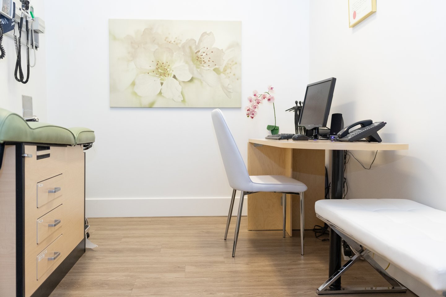
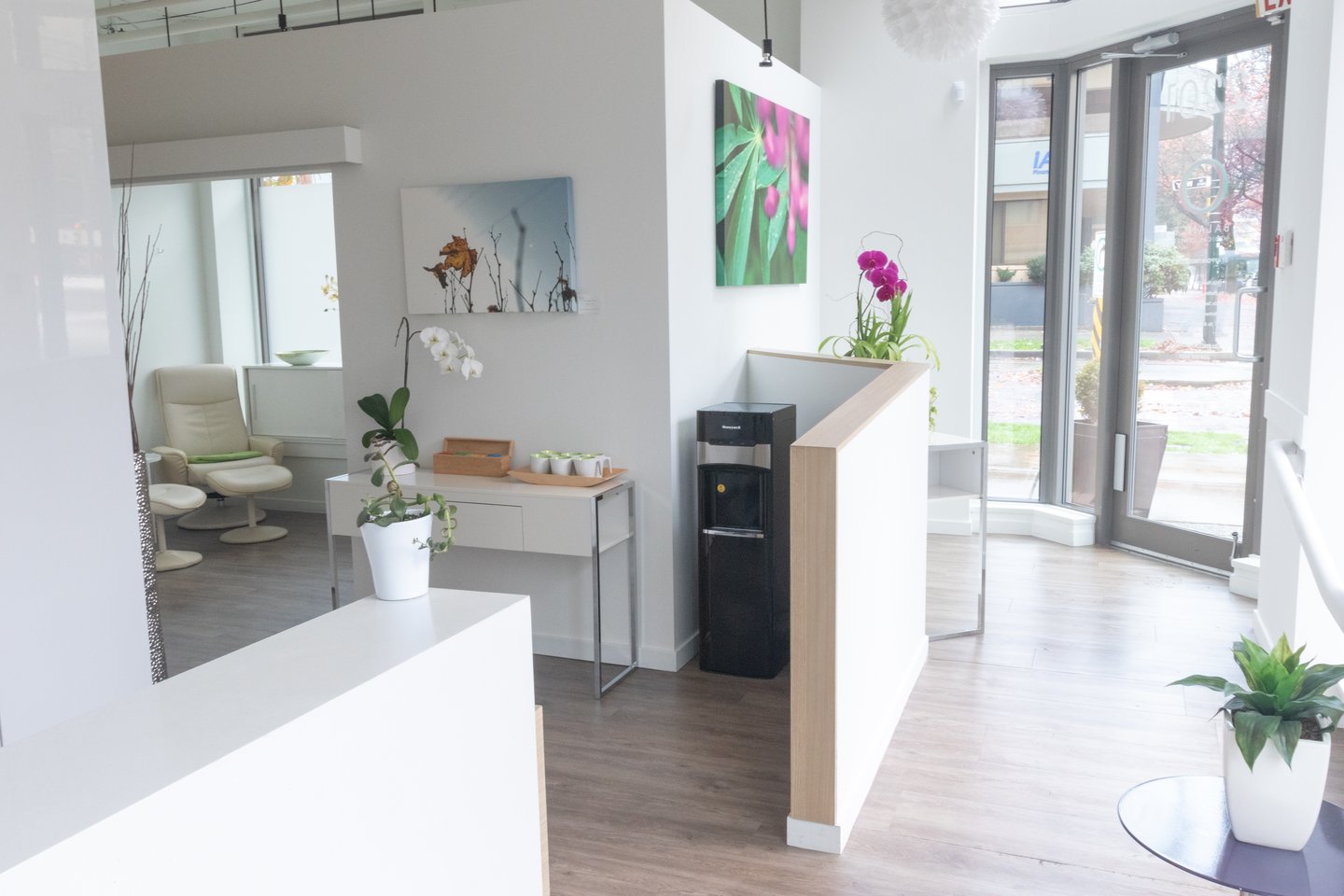
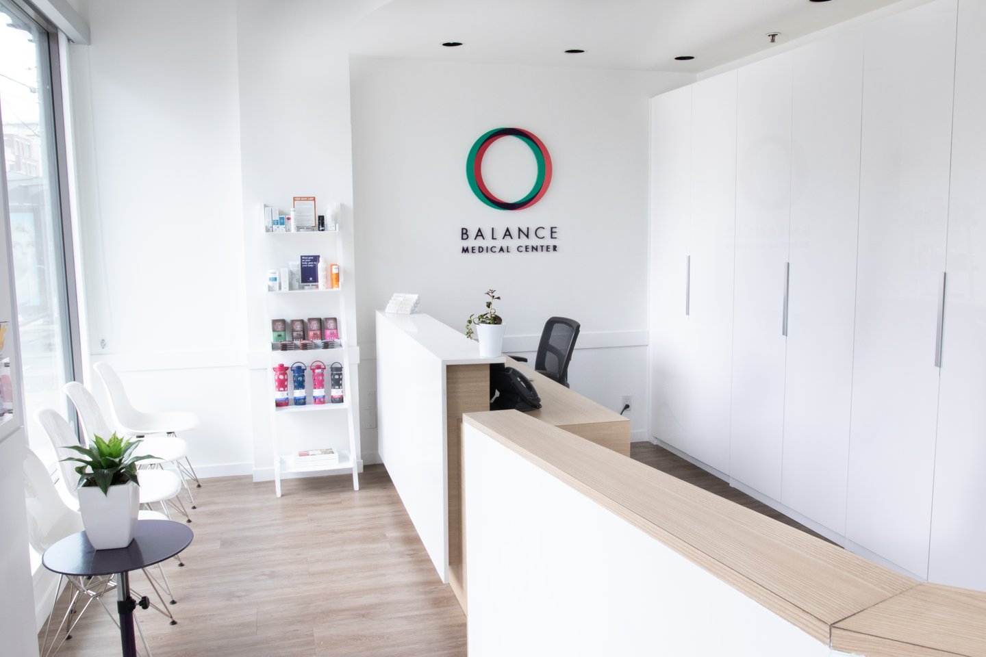
Kavita Kent is owner of two Vancouver clinics—Balance Medical Centre and Vancouver’s Women’s Clinic—both of which integrate traditional and holistic approaches to medicine. The spacious clinics were renovated in the last few years “with the goal of creating a calming, supportive space for healing,” she said. Decor elements include clean lines, uncluttered spaces and comfy furniture. The walls are a soft white and the lighting warm. Floors are birch, and the reception desks are birch and white marble. Plants and greenery throughout contrast the predominant white. Along with large windows, the space has “a feeling of calm and connection to nature,” said Kent. Sparsely filled bookshelves also add warmth. Artwork on the walls “has a calm, beachy feel.”
While lux interiors may not be affordable for many clinics, Lawrie says, the principles of uncluttered, soothing, welcoming design are attainable at all price points. Even a calming piece of photography or artwork can help, as can a fresh coat of paint. But what colour?
According to The Direct Primary Care Journal (“Paint Color Psychology, Inside Medical Offices”), in healthcare interior design, the colour green is often used to create a calm and relaxing atmosphere. Green, similar to blue, is soothing to the eyes. Designers use green in multiple shades or in combination with other calm and soothing colours, to create a restorative effect.
Read: How to do everything better: Squeeze in extra patients
At the same time, according to Lawrie, there isn’t really any rule about which colour to use.
“Obviously most people don’t paint their practice walls chartreuse or bright pink, but I don’t think it’s because you can’t. Ask, what feels good to you? I always take in paint chips and say, ‘What do these colours feel like to you?’ If you feel really good about what your space looks like and how it feels to you, your patients will feel it too.”
And, of course, it’s not just about the patients. The colour and decor affects the whole team, who don’t just visit the clinic for an hour, but live in it all day, every day.
“The look and feel of the space impacts the mood of your staff, so if your waiting room is really old and dirty and not nice to look at, your staff are going to be affected by that—it’s depressing.” If it’s fresh and uncluttered, it’s energizing, she said.
Bottom line: “If you want to really give your practice a boost in the arm, it’s really about changing visually.”
Read: How to do everything better: Deal with demanding patients


